Marcos Trovão
Real Estate Broker (@marcostrovao)
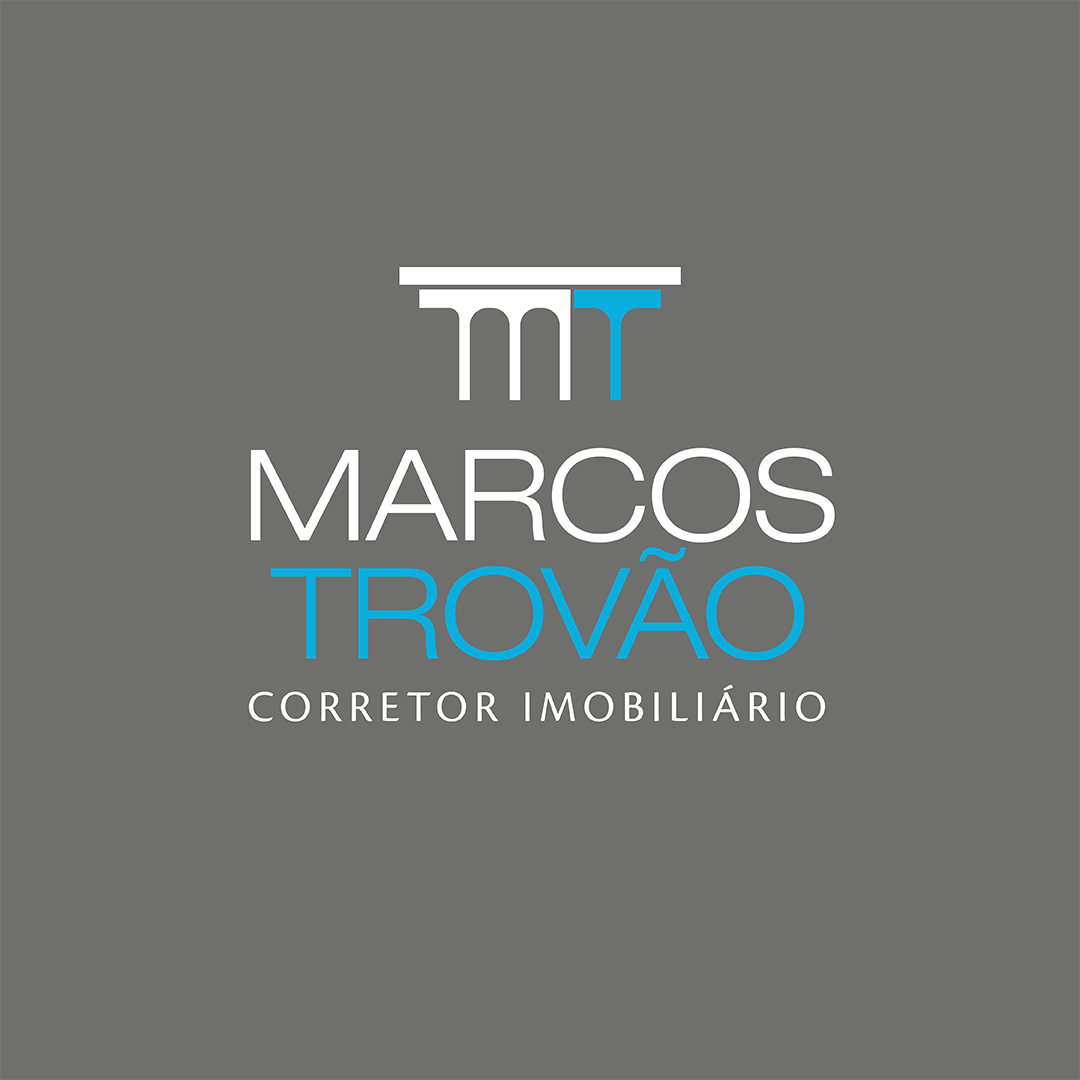


Through symbol and typography, his visual identity translates the requirements to represent him in the real estate market.
The Roman column icon, represented by his name initials M and T, symbolizes experience and solidity, essential characteristics for a professional or business in the real estate market.
The blue and gray colors already attend both residential and commercial niches. In this case, the dark gray color represents seriousness but also serves as neutrality to highlight the light blue color, which adds to the jovial premise and represents nobility, creating a sense of security and promoting confidence in the client's service. In addition, both colors used in the client's visual identity already exist in the corporate environment worldwide.
Owner Testimonial:
"I'm delighted with the result. I believe that one of the great differences of Marcelo is the power to listen and dive into the client's niche. In my case, I can say that the delivery was surgical. I highly recommend the services of Marcelo Teixeira".
Manoela Araújo
Lawyer (@manoelasaraujo.adv)


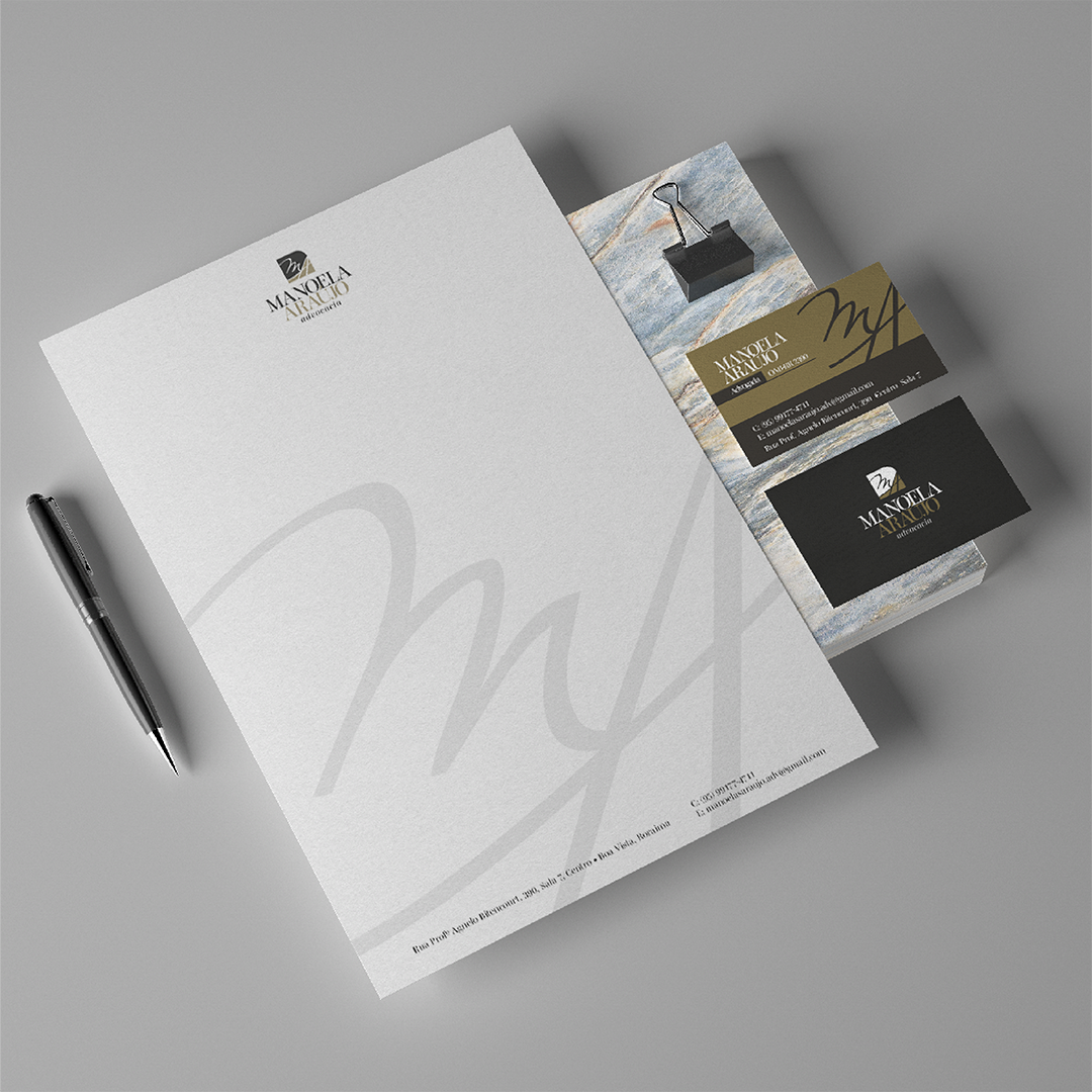
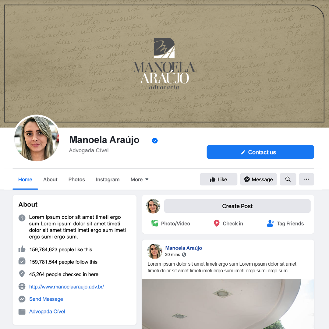
Escaping from the traditional use of the Scale, or the Lady Justice, it was chosen to use her name initials abstractly, also serving as a watermark in other applications. Adding a curve in one of the square's vertices breaks its rigidity, making it more feminine.
The classical serif typography, which originated from the foundations of law, was maintained all caps on the lawyer's name, transmitting grandiosity.
A dark gray color brings seriousness to the identity, and the yellow gold represents femininity, complemented by the white color's neutrality.
Owner Testimonial:
"I sought an elegant, sophisticated, and feminine visual identity. Marcelo certainly managed to achieve exactly all the qualities I wanted. I was amazed when I saw my logo ready. I could see myself in all its features."
Manu Araújo Accessories
Jewelry On-line Store (@manuaraujoacessorios)

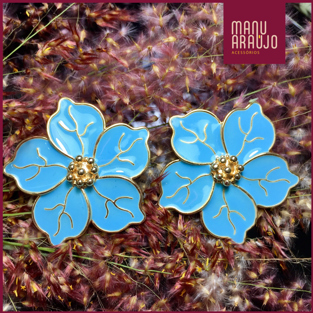
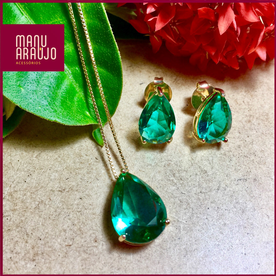
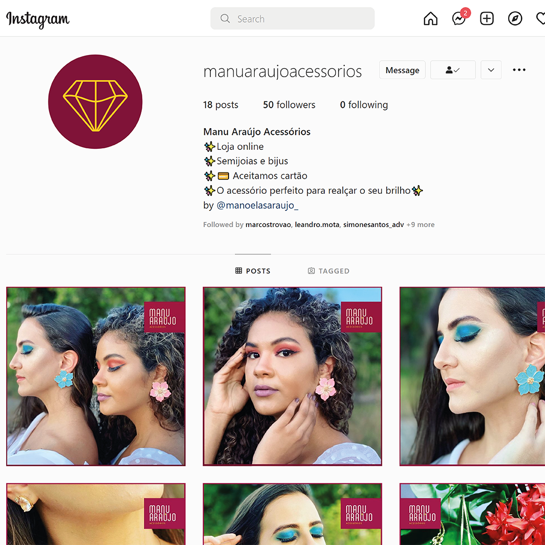
This logo is all about color and femininity. To achieve those features, rounded and curvy typography was used on the client's name, creating a link between first and last names and making it unique.
A gem drawn in linework gently forms the letter M while it sits between A and N.
The intense wine color contrasts with the rose gold and gold colors and works well mixed with her colorful products.
A gem drawn in linework gently forms the letter M while it sits between A and N.
The intense wine color contrasts with the rose gold and gold colors and works well mixed with her colorful products.
Owner Testimonial:
"Marcelo Teixeira managed to convey, through my brand, the authenticity and characteristic of a brand made for contemporary women who seek accessories for their everyday looks."
Various Visual Identities

Digital Photo Company

App Development Company

Travel Company

Personal Shopper
Beach Inn
Architecture Professional

Gas Station

Hortifruti Market

Residential Building
Lawyer

Architecture Professional

Institution Development Agency

Veterinary

Medical Group


Architecture Research Group
Video Studio

Elementary School
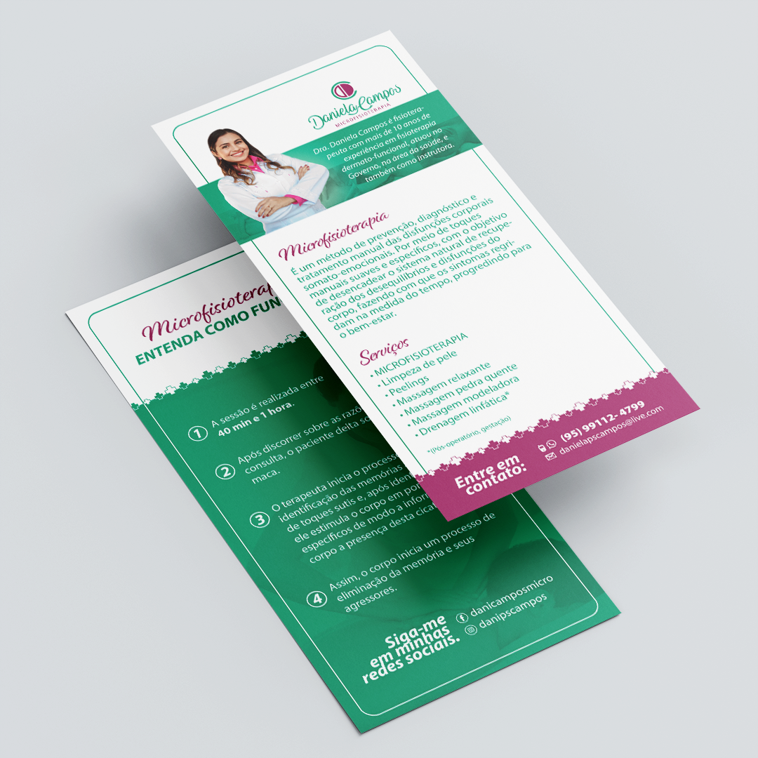
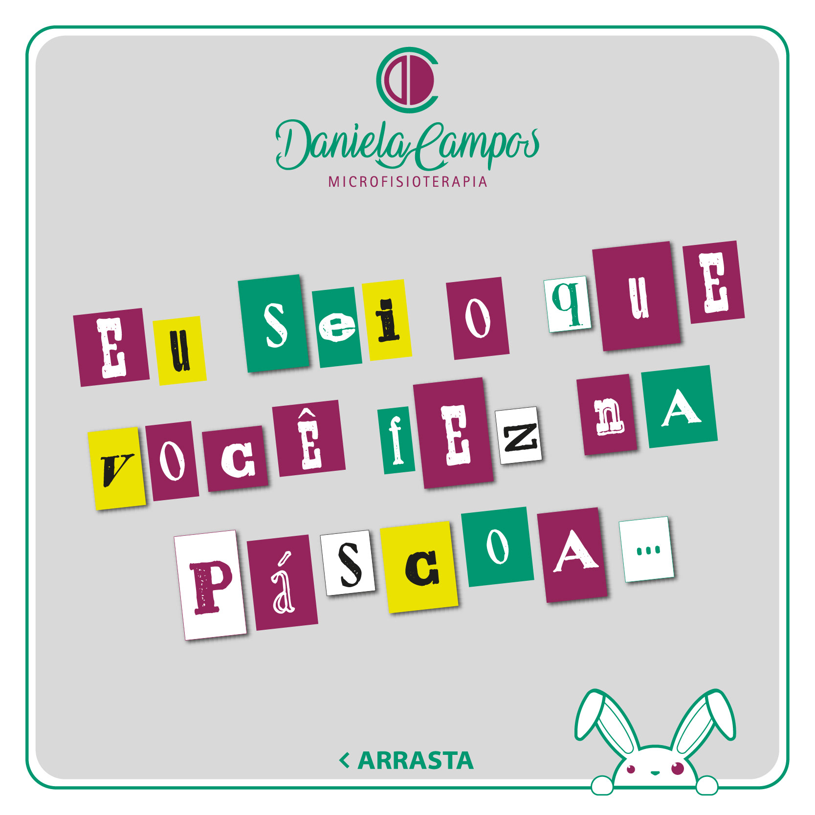
Dr. Daniela Campos
Micro physiotherapist (@danicamposmicro)


Owner Testimonial:
"Marcelo Teixeira always understands the professional's needs, and thus creates unique logos!!! This conveys exactly what the client is looking for...he is a complete artist!!! Just gratitude for everything!!!"
LAPDAR ENERGY

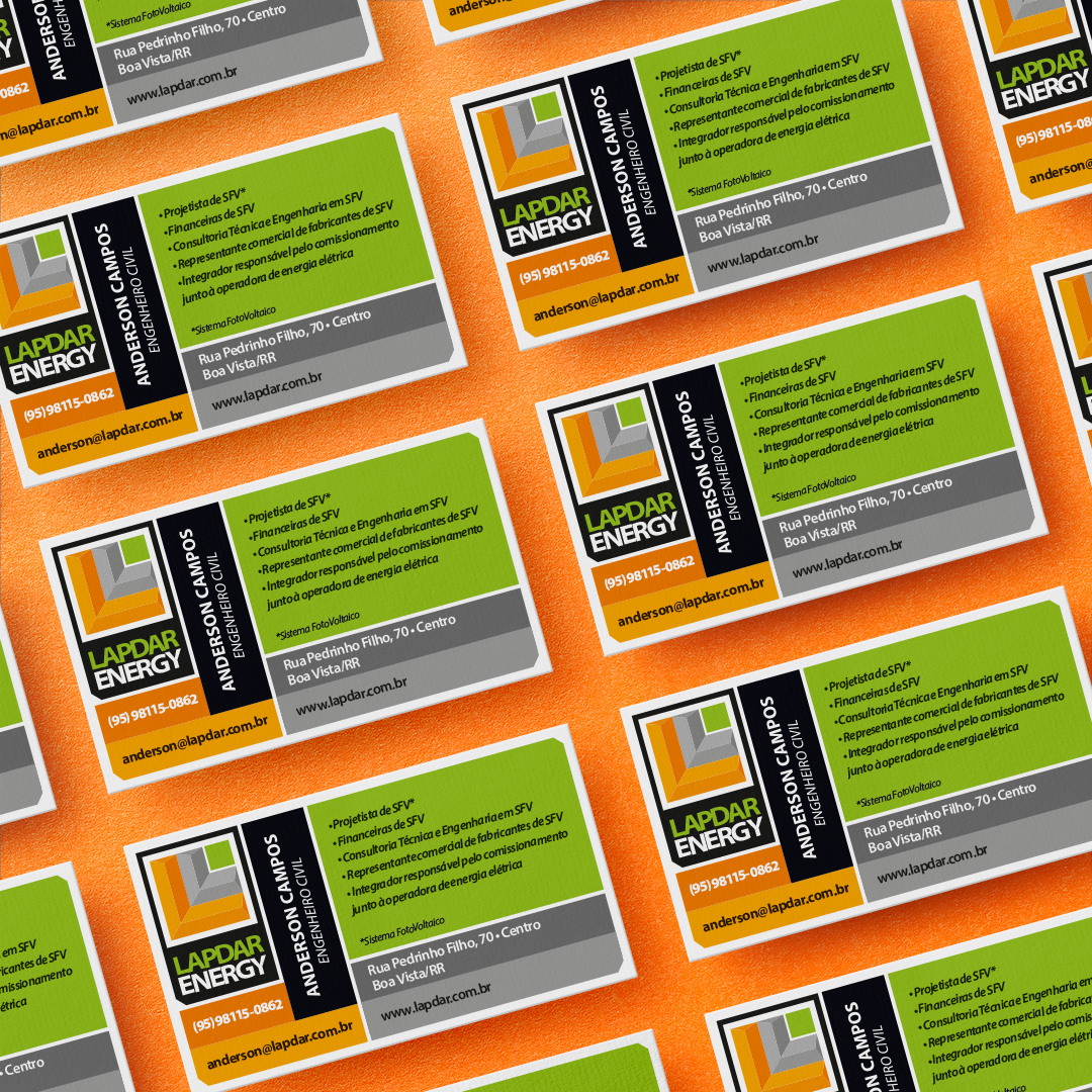


Plate information for illustrative purposes only
Lapdar Energy was an engineering company focused on clean energy, mainly solar energy and clean construction methods.
The logo has a stamp format that makes it easy to apply on different platforms. The symbol represents a leaf formed by two L-shaped buildings and a front garden.
The green color represents its sustainability, the orange and gray represent construction, and all three colors draw attention from far away.
Owner Testimonial:
"He's made a media and color standardization manual for my company as complete and creative as I had ever seen. Perfect!".
SESC Tepequém Ecological Resort
This folder was created for the SESC Tepequém Ecological Resort. Tepequém is in the State of Roraima countryside, full of natural resources and incredible sights.
A stone hanging on a hill in front of the resort, named "Indian face," inspired this logo. Native animals were used as a symbol to identify each cabin.
The overall look of the folder is supposed to be fun, informative, and right to the point.
A stone hanging on a hill in front of the resort, named "Indian face," inspired this logo. Native animals were used as a symbol to identify each cabin.
The overall look of the folder is supposed to be fun, informative, and right to the point.
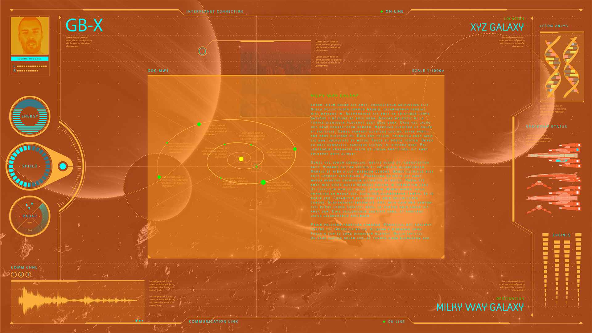
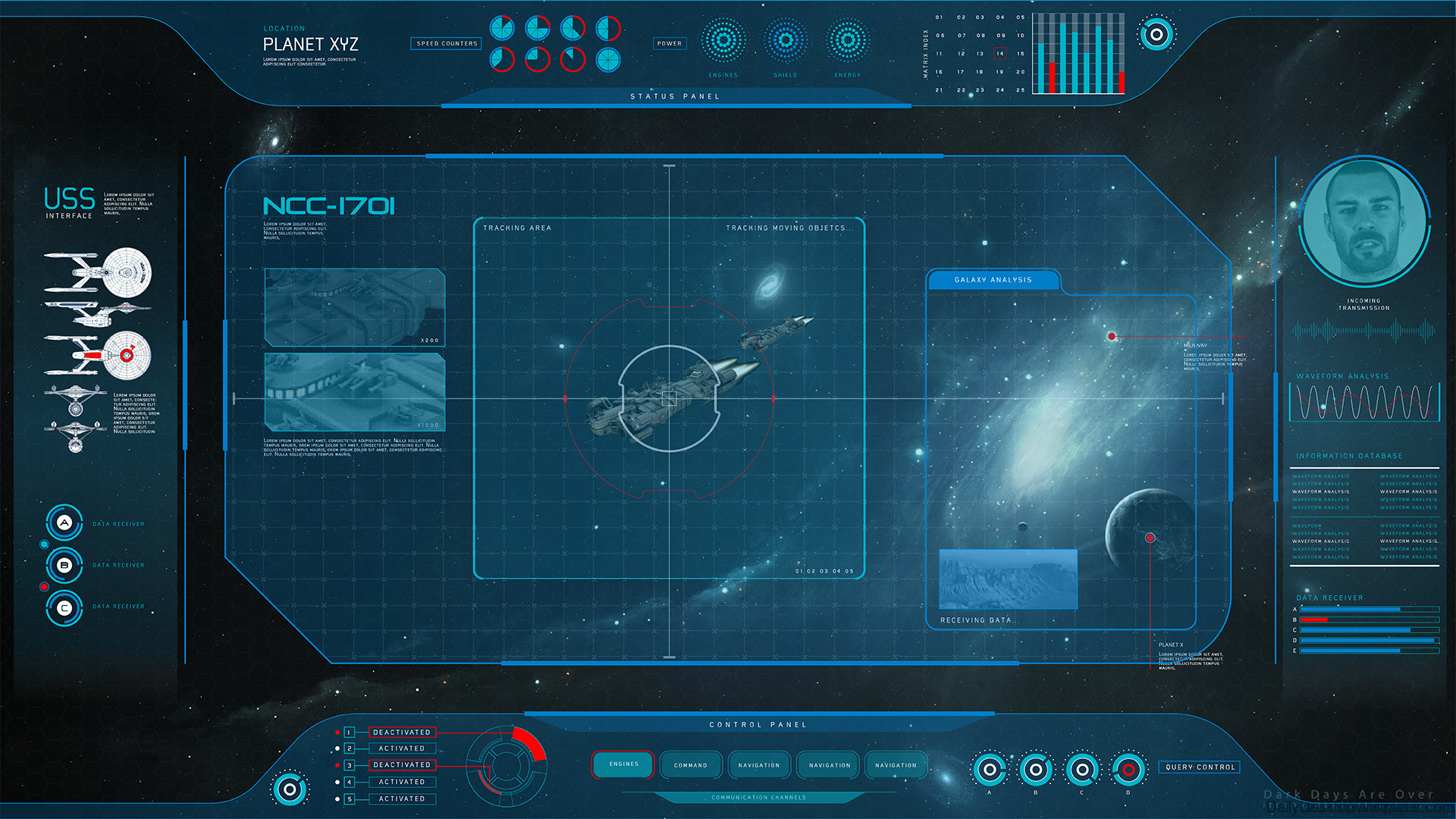
Graphic User Interfaces created for a short film named Galactic Battles. You can see more of it in the MOTION GRAPHICS section of my portfolio.